Mobile-First Design: Why It's No Longer Optional

You might still be designing websites for desktop users first. But this is the wrong approach in 2026. Today, mobile devices account for the majority of web traffic worldwide. Furthermore, search engines rank mobile-friendly websites higher. As a result, mobile-first design has become a best practice that is now an absolute necessity for businesses.
Let's be clear: mobile-first design is not about making your desktop website work on mobile devices. Rather, it's about designing for mobile users first and then optimizing for larger screens second. In addition, this approach provides better experiences for all devices and improves SEO and conversions.
We are writing this blog post to tell you why mobile-first design is now a necessity and how businesses can benefit from this approach.
What Is Mobile-First Design?
Before we tell you why mobile-first design is important, let's define what mobile-first design is. Mobile-first design begins the design process on mobile screens and with mobile limitations. First, designers begin designing interfaces for small touchscreens. Second, they progressively enhance designs for tablets and desktop computers.
Furthermore, mobile-first design focuses on the most necessary content and functionality. In addition, it takes into account touch behavior, thumb areas, and the limited screen size. Moreover, it emphasizes speed and performance, which are essential for mobile networks. Thus, mobile-first design is a completely new approach to design. As a result, it provides better experiences than adapting desktop design for mobile.
Why Mobile-First Design Has Become a Necessity
Mobile Traffic Dominates
The statistics clearly indicate that mobile-first design is a necessity. Firstly, more than 60% of web traffic comes from mobile devices worldwide. Secondly, in most regions, mobile traffic already accounts for 70-80% and more.
In addition, younger audiences prefer mobile-only. Furthermore, mobile traffic continues to rise while desktop traffic shrinks. Moreover, most users access websites only through mobile devices and never through a desktop. Thus, desktop-first design means designing for the minority. As a result, companies that focus on desktop design miss the majority of potential customers.
Google's Mobile-First Indexing
Mobile-first indexing is a search engine optimization (SEO) necessity. First, Google indexes and ranks using mobile versions. Second, poor mobile experiences result in lower search engine rankings.
Furthermore, mobile page speed is a direct factor in SEO rankings. In addition, mobile usability problems impact search engine visibility. Moreover, Google's algorithms favor mobile-friendly sites more and more. Thus, mobile-first design is a mobile SEO necessity, not just a mobile user experience (UX) issue. As a result, poor mobile design costs you organic traffic directly.
Mobile Users Have Different Needs
Mobile-first design recognizes mobile user behavior differences. First, mobile users have shorter, more functional sessions. Second, mobile users demand fast answers and actions.
Furthermore, mobile use cases involve on-the-go activities that demand fast results. In addition, mobile users lack tolerance for complex navigation. Moreover, touch interfaces demand different designs than mouse clicks. Thus, mobile-first design better meets actual mobile user needs. As a result, conversion rates increase with well-designed mobile experiences.
Performance and Speed Requirements
Mobile-first design is inherently performance-oriented. First, mobile-first design by necessity is performance-driven. Second, mobile-first design removes unnecessary elements.
In addition, mobile users demand instant loading regardless of network conditions. Furthermore, large desktop designs are abysmal on mobile devices. Moreover, performance has a direct correlation with bounce rates and conversions. Therefore, mobile-first design results in faster experiences. As a result, speed optimizations benefit all users regardless of devices.
Advantages of Mobile-First Design
Enhanced User Experience
Mobile-first design provides a superior experience for all users. First, mobile-first design is all about stripping down to the bare essentials. Second, mobile-first design provides better usability on all devices.
In addition, mobile-first design removes unnecessary complexity. Furthermore, mobile-first design prioritizes content over graphics. Moreover, a touch-friendly design is beneficial for desktop users as well. Therefore, mobile-first design benefits all users. As a result, user satisfaction increases for all devices.
Increased Conversion Rates
Mobile-first design enhances business results. First, improved mobile experiences lead to a large boost in conversion rates. Second, mobile-optimized checkout flows lower abandonment rates.
Furthermore, mobile-first design makes calls-to-action more visible and accessible. In addition, it removes obstacles from user flows. Moreover, mobile-first design enables faster mobile experiences, keeping users engaged. Thus, mobile-first design boosts revenue. As a result, businesses experience tangible ROI from mobile optimization.
Improved SEO Performance
Mobile-first design enhances search engine optimization (SEO) in several ways. First, Google favors mobile-friendly designs with improved rankings. Second, lower bounce rates from quality mobile experiences indicate quality content.
Furthermore, faster page loads improve SEO. In addition, mobile-first design often enhances technical SEO aspects. Thus, mobile-first design is a form of SEO strategy, not merely design.
Future-Proofing
Mobile-first design is future-proof. First, it provides flexible foundations for new devices. Second, it provides patterns for smartwatches and small screens.
Furthermore, mobile-first design thinking is easily applicable to voice interfaces. In addition, it is ready for foldable and flexible screen devices. Thus, mobile-first design is not merely for mobile devices but for future interfaces.
Mobile-First Design Implementation
Mobile Wireframing as a Starting Point
Every project should begin with mobile wireframing. First, design for small screens before larger ones. Second, determine what matters most for mobile.
In addition, validate mobile interaction designs using real mobile devices. Further, design for thumb reach areas for critical elements. Hence, mobile limitations lead to better design choices.
Progressive Enhancement Strategy
Begin with a mobile foundation. First, design and develop a fully functional mobile experience. Second, add progressive enhancements for larger screens.
In addition, prioritize basic functionality for all devices. Further, apply responsive design methods for fluid layouts. Hence, progressive enhancement ensures great experiences for all.
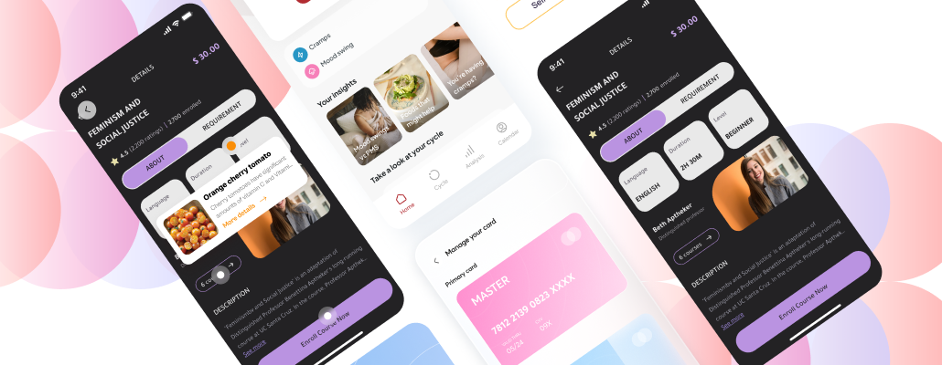
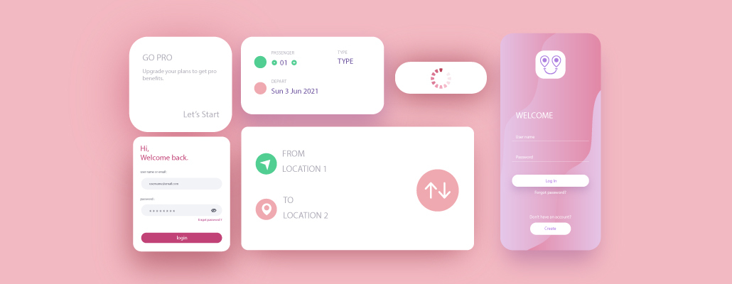
Optimize for Touch Interactions
Design for finger-friendly interactions. First, design buttons and links large enough for precise tapping. Second, ensure sufficient space between interactive elements.
In addition, design for mobile gestures such as swiping and pinching. Further, avoid hover interactions. Hence, touch-friendly design makes mobile usability much better.
Prioritize Performance
Mobile-first design requires speed. First, optimize images and assets for mobile networks. Second, reduce the size of JavaScript and CSS files.
In addition, use lazy loading for content below the fold. Finally, use mobile-friendly formats and compression. As such, performance optimization is essential in mobile-first design.
How Tangent Technologies Practices Mobile First Design
At Tangent Technologies, we practice mobile-first design in every project we undertake. We know that mobile is the dominant force in web usage and business success. As such, we design for mobile users first and foremost in every project.
We provide:
-
Mobile First Strategy: Designing for mobile from project inception
-
Responsive Development: Fluid designs that work anywhere
-
Performance Optimization: Speed-optimized mobile experiences
-
Touch-Oriented Interfaces: Designs optimized for touch navigation
-
Mobile Testing: Comprehensive testing on real devices
Our team understands that mobile-first design is no longer a choice. We design experiences that look and feel amazing on mobile and further enhance on larger screens.
Get in touch with Tangent Technologies today.
Conclusion
"Mobile is becoming not only the new digital hub, but also the bridge to the physical world." – Thomas Husson.
Mobile-first design is no longer a choice for businesses that aim to succeed online. With mobile traffic dominating, Google's mobile-first indexing, and the need for flawless mobile experiences, desktop-first design is no longer relevant.
Mobile-first design helps you deliver better user experiences, drives more conversions, enhances SEO, and future-proofs your online presence. As such, every new project should begin with mobile. In this blog, we have discussed why mobile-first design is now a necessity. We hope you find this blog helpful.
FAQ's
1. What is mobile-first design?
Mobile-first design is a design methodology that begins the design process on mobile and small screens and progressively enhances on larger screens. It puts the needs of mobile users, touch interactions, performance, and essential content first, rather than designing for desktop on mobile.
2. Why is mobile-first design essential for SEO?
Mobile-first design is essential for SEO as Google indexes and ranks all websites using their mobile versions. Mobile-unfriendly websites rank lower, mobile loading speed impacts rankings directly, and mobile usability problems impact search visibility severely.
3. How does mobile-first design enhance conversion rates?
Mobile-first design enhances conversion rates by fixing friction in mobile experiences, optimizing checkout flows on mobile, improving CTA accessibility on touch screens, reducing page loading speeds, and designing experiences that align with mobile user behavior.
4. Is responsive design the same as mobile-first design?
No, responsive design is about making layouts flexible and adapting to varying screen sizes, but it can begin with a desktop design. Mobile-first design is a mindset that starts with mobile limitations and then enhances them for larger screens. You can apply responsive design principles to a mobile-first design mindset.
5. How much does mobile-first design cost?
Mobile-first design doesn't have to cost more than traditional design methods when implemented from the beginning of the project. It may increase initial design time by 10-20%, but it saves money by avoiding the cost of mobile optimization down the line and provides better ROI due to improved conversions and SEO.