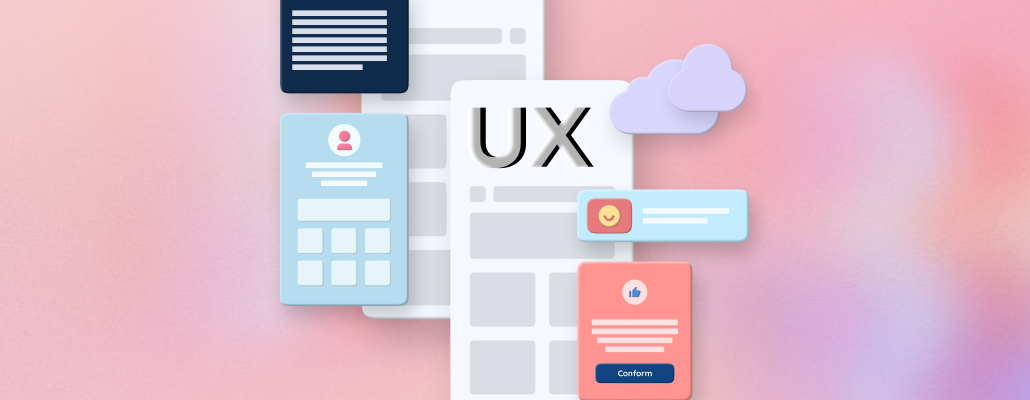
Adapting the UX Design Process for Small Screen Experiences with a Mobile-First Approach (2024 Update)

In today's dynamic digital landscape, embracing a mobile-first approach isn't just a trend; it's a necessity. Mobile internet usage has surged past desktops, with over 53% of global web traffic coming from smartphones. Tailoring the user experience to smaller screens has become paramount, but what does that mean for the UX design process? Let's explore the evolution of UX design, the significance of small-screen experiences, and how to adapt your process for mobile-first success.
Evolution of UX Design:
While the desktop was once king, user behavior has shifted dramatically. Mobile users now engage more frequently and for longer than desktop users (App Annie, 2023). This fundamental shift has forced a paradigm change in UX design, with mobile taking center stage.
Significance of Small Screen Experiences:
The mobile user base is diverse and constantly evolving. Users interact with their devices on the go, often with specific contexts and limited attention spans. This demands a thoughtful and user-centric approach to small-screen design.
Key Principles of Mobile-First UX Design:
- Prioritize content and functionality: Focus on core tasks and ensure clear and concise information architecture. Streamline navigation for easy information access.
- Adapt user personas: Consider mobile user context, on-the-go usage, and limited attention spans. Develop personas that reflect these unique needs.
- Embrace responsive design: Utilize flexible grids and layouts that adapt seamlessly to various screen sizes, ensuring consistent user experience across devices.
- Optimize for touch interactions: Understand touch gestures and their impact on usability. Design interfaces that are intuitive and finger-friendly.
- Prioritize performance: Optimize images, minimize HTTP requests, and leverage browser caching for fast loading times and a smooth browsing experience.
- Test rigorously: Conduct user testing specifically for small screens. Gather feedback, iterate, and refine your design continuously.
Challenges in Mobile-First UX Design:
Balancing aesthetics with functionality: Mobile interfaces must carefully balance visual appeal and user-friendly interactions. Catering to diverse devices: A one-size-fits-all approach needs to be revised. Consider different screen sizes, resolutions, and operating systems.
Overcoming Challenges and Enhancing Mobile UX:
User feedback and iterative design: Continuously gather feedback from mobile users and implement changes based on their insights. This ensures a dynamic and user-responsive design.
Mobile-first SEO strategies: Optimize content for mobile search engines to improve visibility and ranking. Google prioritizes mobile-friendly websites in search results.
Stay informed about future trends: Anticipate advancements in mobile technology, such as voice search and wearable devices, and adapt your design strategies accordingly.
Case Studies: Successful Mobile-First UX Designs:
Analyze and learn from successful examples like Uber, Airbnb, and Spotify. These companies have mastered mobile-first design, providing valuable insights for your projects.
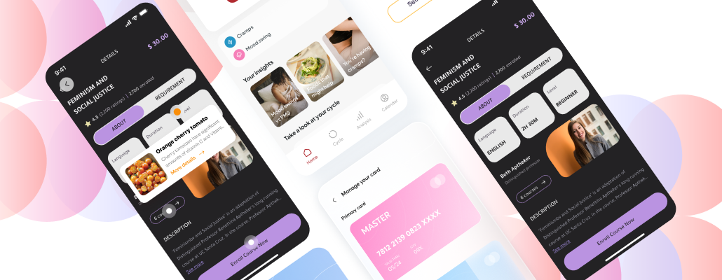
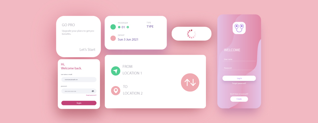
One of Tangent’s Case Studies is Amal - A must-read:
Hope for life - Amal
Affordable Cancer Diagnosis Using Artificial Intelligence
So, what is Amal?
Amal is a groundbreaking digital platform that aims to provide affordable cancer diagnosis services using artificial intelligence (AI) technology. By leveraging advanced machine learning algorithms, Amal streamlines the diagnosis process reduces costs, and enhances accessibility for needy patients.
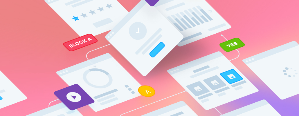
What did we do?
Research
Interface Design
Prototyping
Design System
Architecture
Social Media Management
Conclusion:
Adapting the UX design process for small screens with a mobile-first approach is a strategic imperative in today's digital landscape. By understanding the evolution of UX design, embracing fundamental principles, and addressing challenges, you can create compelling mobile experiences that resonate with users. The future of UX design is undoubtedly mobile-first, and those who embrace it will thrive.
FAQs
Q1. Why is a mobile-first approach essential in UX design?
A: Over 53% of global web traffic comes from smartphones. Mobile users engage more frequently and for longer durations than desktop users.
Q2. What are the critical challenges in mobile-first UX design?
A: Balancing aesthetics with functionality and catering to over 20,000 different mobile device models in the market.
Q3. How can user feedback drive iterative design in mobile UX?
A: User testing tools like UserTesting.com and Lookback.io allow gathering feedback from real
Mobile users, informing iterative design improvements.
Q4. Why is responsive design crucial for small-screen experiences?
A: 85% of users expect a website to look good on all devices. Responsive design ensures consistent user experience across various screen sizes.