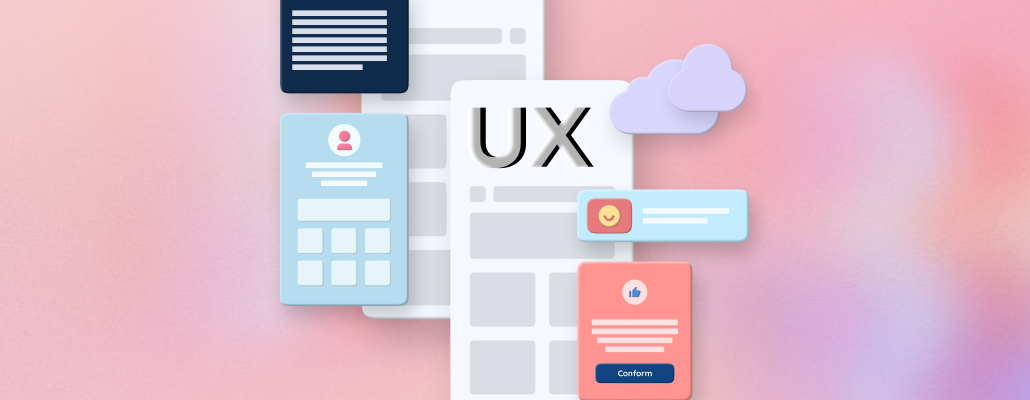
6 Common UX Mistakes That Most Designers Don't Know
The design world has opened up like never before with new technologies and techniques to play with. As a result, designers are able to create stunning user experiences that feel intuitive, interactive and engaging all at once.
1) Unclear Call to Action
When it comes to designing a user interface, one of the most important things to keep in mind is the call to action. The call to action is what tells the user what they need to do next, and it needs to be clear and concise. Unfortunately, many designers make the mistake of making the call to action too unclear, which can lead to confusion and frustration for the user.
Some common mistakes that designers make with regard to the call to action include using too much text, using confusing or unfamiliar terminology, or making the call to action too small or difficult to see. Additionally, designers sometimes place the call to action in a location that is not intuitive or easy to find. All of these mistakes can lead users to give up on trying to use your interface altogether.
To avoid these pitfalls, take care to make your call to action clear and easy to understand. Use simple language that users will be familiar with, and make sure that the call to action is prominently displayed so that users will know where to go next. By following these tips, you can ensure that your users will have a positive experience with your interface and be more likely to convert into customers or clients.
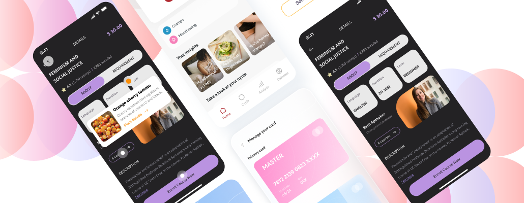
2) User Interface is Too Busy
The user interface of many websites and apps is too busy, with too much going on. This can be overwhelming for users, making it difficult to find what they're looking for.
When designing your user interface, less is more. Keep it simple and clean, with only the essential elements. This will make it easier for users to navigate and use your site or app.
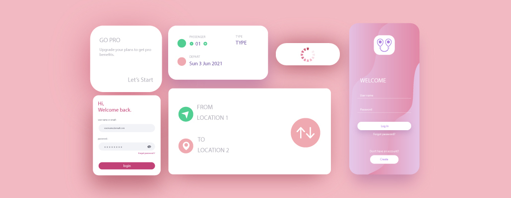
3) Inconsistency in Design Language
One of the most common UX mistakes that designers make is using inconsistent design language throughout their product. This can create confusion for users and make it difficult for them to use your product effectively.
When designing your product, it's important to be consistent in the language you use. Make sure that all buttons, labels, and other interface elements use the same terminology. This will help ensure that users understand how to use your product and can easily navigate through it.
By taking care to use consistent design language throughout your product, you can create a better user experience and avoid common UX mistakes.
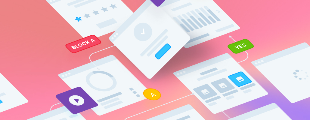
4) Confusing Menu Navigation (i.e. Not Clear How to Navigate Back or Forward)
One of the most common UX mistakes that designers make is creating confusing menu navigation. When users can't figure out how to navigate back or forward, they get frustrated and may even give up on using your site or app altogether.
There are a few things you can do to avoid this mistake:
1. Make sure your menus are clear and easy to understand.
2. Use consistent labeling for your menus across all pages.
3. Provide visual cues to help users understand where they are in the navigation hierarchy.
4. Allow users to easily return to the home page from any other page on your site or app.
5. Test your navigation with real users to make sure it's easy to use.
5) Poorly Written Content
One of the most common UX mistakes is poorly written content. This can be a major turnoff for users, as it can make your site or app seem untrustworthy or even unprofessional.
Poorly written content can also be confusing and frustrating for users, leading them to abandon your site or app altogether. To avoid this, be sure to proofread your content carefully before publishing it. If possible, have someone else check it over as well to catch any errors you may have missed.
Finally, beware of using clichés or overused phrases in your content. Not only are they often unoriginal, but they can also make your writing sound stale and unimaginative. Instead, try to come up with fresh ways to say things and avoid using phrases that have been done to death.
6) Loading Time Issues
One of the most common UX mistakes that designers make is forgetting to take loading time into account. It's easy to overlook this when you're focused on making your design look good, but it's important to remember that users will often be accessing your site or app on slower internet connections.
There are a few things you can do to help mitigate loading time issues:
- Use compressed images
- Minimize HTTP requests
- Use a content delivery network (CDN)
If you keep these things in mind, you can help ensure that your users have a positive experience even if they're not on the fastest connection. Visit Tangent Blogs to keep yourself updated with more UX articles.